


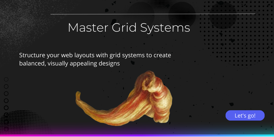
Part 1: Designing with Grid Systems: Structuring Your Layout
Course Description
This module covers the basics of grid systems and their application in web design.
A well-structured design is the foundation of any visually appealing and functional digital experience. Grid systems serve as the backbone of modern web and graphic design, providing a framework that enhances alignment, consistency, and readability. Whether designing a website, a mobile app, or a printed publication, understanding and implementing grid principles allows designers to create layouts that are not only aesthetically pleasing but also intuitive and user-friendly.
Grids have been used in design for centuries, originating from print layouts before becoming a fundamental part of digital interfaces. They help organize content in a way that guides the viewer’s eye naturally while ensuring balance and proportion. By using a structured approach, designers can create harmony between different elements, making the experience seamless across various screen sizes and resolutions. In the ever-expanding digital space, a solid grasp of grid systems is essential for producing adaptable and responsive layouts that function effectively on desktops, tablets, and smartphones.
One of the key advantages of grid-based design is its ability to create visual consistency. A well-defined grid allows for structured alignment of text, images, and interactive elements, preventing clutter and enhancing readability. When users navigate a website or application, a logical and organized design helps them find information quickly and effortlessly. Without a grid, layouts can feel chaotic and unstructured, leading to a poor user experience.
Course Curriculum
£45.00
£70.00
Course includes:
-
 Level
Level
-
Intermediate
-
 Duration
2h 18m
Duration
2h 18m
-
 Lessons
1
Lessons
1
-
 Certifications
Yes
Certifications
Yes
-
 Language
-
English