


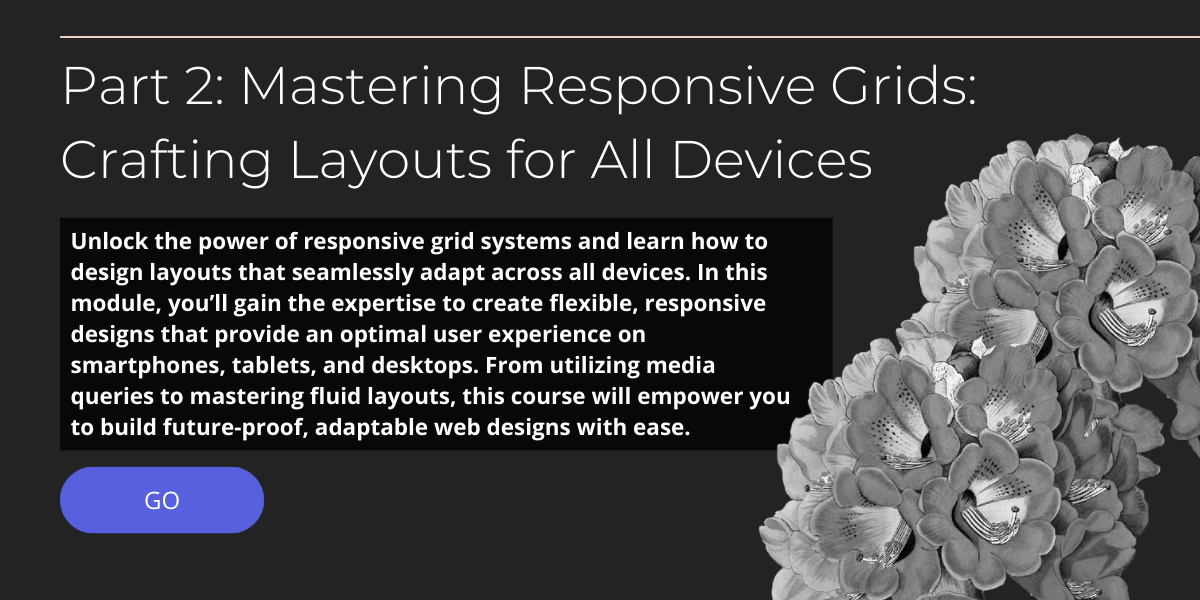
Part 2. Responsive Layout Mastery: Designing for Seamless Experiences Across Devices
Course Description
In Responsive Layout Mastery: Designing for Seamless Experiences Across Devices, discover how to design websites that automatically adapt to all screen sizes and devices. This course teaches you the principles of responsive design, including fluid grids, media queries, and flexible images. You will learn how to optimize your layouts to ensure a consistent and intuitive user experience across desktops, tablets, and mobile devices. Enhance your design skills to create dynamic, user-friendly websites that engage visitors, no matter how they access your site.
This Course Fee:
£38.00
£38.00
£54.00
Course includes:
-
 Level
Level
-
Intermediate
-
 Duration
2h 34m
Duration
2h 34m
-
 Lessons
2
Lessons
2
-
 Certifications
Yes
Certifications
Yes
-
 Language
-
English